Color Psychology in Interiors: What Each Hue Says About Your Space
Color isn't just a design choice—it's an emotional language.
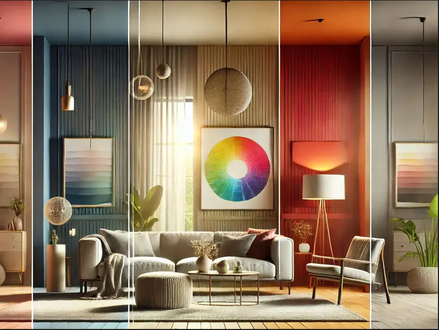
Introduction
Color isn't just a design choice—it's an emotional language. In interior design, the colors you use can dramatically influence the atmosphere, energy, and even the perceived size of a room. Understanding color psychology helps you make intentional design choices that enhance both style and mood.
In this blog, we’ll break down what different colors represent, how they affect your space, and where they work best in your home.
1. White – Clean, Calm, and Expansive
What it says: Simplicity, clarity, freshness
Best for: Kitchens, bathrooms, minimalist spaces
White reflects light, making small spaces feel larger and airier. It provides a neutral foundation and works beautifully in modern, Scandinavian, or coastal designs. Just be sure to layer in texture and contrast to avoid a sterile feel.
2. Gray – Sophisticated and Versatile
What it says: Neutrality, balance, refinement
Best for: Living rooms, bedrooms, transitional spaces
Gray is a modern neutral that adapts well to both warm and cool palettes. Lighter grays are calming and minimal, while darker charcoals add drama and depth. Use it to tone down bold accents or bring cohesion to mixed materials.
3. Blue – Calming and Trustworthy
What it says: Peace, stability, serenity
Best for: Bedrooms, bathrooms, home offices
Blue has a calming effect, especially in softer shades like powder or sky blue. Navy and deep indigos offer sophistication and work well for creating cozy or moody atmospheres. It pairs effortlessly with wood, white, and metallics.
4. Green – Restorative and Natural
What it says: Growth, harmony, renewal
Best for: Living rooms, kitchens, reading nooks
Green connects us to nature, making it one of the most refreshing and grounding choices. Sage and olive tones are subtle and earthy, while emerald and forest green add richness. Perfect for biophilic or rustic interiors.
5. Yellow – Cheerful and Energizing
What it says: Optimism, warmth, creativity
Best for: Kitchens, dining rooms, creative spaces
Yellow reflects happiness and sunshine. Soft butter yellows feel cozy, while bright lemons add energy. Use in moderation or as an accent—too much yellow can become overstimulating in large doses.
6. Red – Bold and Passionate
What it says: Energy, power, excitement
Best for: Dining rooms, entryways, accent walls
Red stimulates the senses and draws attention. It can create a cozy, enveloping space when used with restraint. Burgundy or terracotta tones offer warmth without overwhelming intensity.
7. Orange – Sociable and Stimulating
What it says: Fun, enthusiasm, vibrancy
Best for: Game rooms, kitchens, casual living areas
Orange encourages conversation and movement. Muted shades like rust, pumpkin, or burnt orange are easier to integrate and offer a welcoming, earthy vibe—especially in boho or eclectic homes.
8. Pink – Soothing and Playful
What it says: Compassion, calmness, charm
Best for: Bedrooms, nurseries, powder rooms
Blush and rose tones are soft and nurturing, while coral or fuchsia bring energy and modern flair. Pink isn’t just feminine—it can feel fresh, modern, and balanced when paired with neutrals or metallics.
9. Purple – Luxurious and Creative
What it says: Royalty, imagination, mystery
Best for: Bedrooms, reading areas, accent walls
Light lavenders are calming and whimsical, while deep plums and aubergines feel rich and opulent. Use purple to add depth and drama, or to highlight a creative flair in your space.
10. Black – Bold, Elegant, and Grounding
What it says: Sophistication, strength, contrast
Best for: Accent walls, lighting, fixtures
Black adds contrast and anchors a space. It can be powerful in small doses—frames, hardware, lighting—or dramatic as a feature wall. Paired with whites, golds, or wood, black makes a room feel grounded and polished.
11. Brown – Warm, Earthy, and Comforting
What it says: Stability, warmth, naturalness
Best for: Living rooms, libraries, rustic spaces
From taupe to chocolate, brown tones create a warm and inviting atmosphere. Great for grounding lighter palettes or softening modern designs with natural materials like wood and leather.
Tips for Using Color Effectively
- Balance bold colors with neutrals to avoid visual overload.
- Consider natural light—north-facing rooms may need warmer hues, while south-facing ones can handle cooler tones.
- Use color to define zones in open layouts.
- Test samples on your wall before committing—colors shift with lighting and surrounding elements.
Conclusion
Understanding color psychology helps you create rooms that not only look beautiful but also feel right. Each hue carries its own energy and message—choose colors that align with the mood you want to evoke in your space.
With intentional use of color, you can transform any room into a vibrant, peaceful, or inspiring place that truly supports how you live and feel.