How Colors Influence Your Home’s Atmosphere & Energy?
Color is one of the most powerful tools in home decor.
Color is one of the most powerful tools in home decor. The shades you choose affect your mood, energy levels, and even your overall well-being. Your home should be more than just visually appealing, it should feel right. The right color choices transform any space, creating an atmosphere that aligns with your emotions, lifestyle, and personality.
Understanding the psychology of color helps you make informed choices. Whether you want a peaceful bedroom, a vibrant kitchen, or a cozy living room, knowing how colors influence emotions allows you to design spaces that complement your needs. By selecting the right tones and hues, you create an environment that enhances your daily life while reflecting your personal taste.
THE BASICS OF COLOR PSYCHOLOGY
How Colors Influence Mood and Perception?
- Colors evoke emotions and impact how you feel within a space.
- Vibrant hues create excitement and energy, while muted tones encourage calmness.
- Lighter shades can make a room feel airy and spacious, while darker colors add intimacy and depth.
Understanding Warm vs. Cool Tones
- Warm Colors (Red, Orange, Yellow): Energizing, welcoming, and stimulating.
- Cool Colors (Blue, Green, Purple): Soothing, relaxing, and calming.
- Neutral Colors (Gray, Beige, White, Black): Versatile, grounding, and timeless.
Why Certain Colors Are Universally Associated with Emotions?
- Red: Boosts energy, passion, and intensity, ideal for social areas but overwhelming in large doses.
- Blue: Calms the mind and promotes focus, perfect for bedrooms and workspaces.
- Yellow: Encourages creativity and happiness, great for kitchens and dining spaces.
- Green: Represents harmony and balance, works well in almost any room.
- Purple: Adds luxury, creativity, and depth, best in moderation to avoid overpowering a space.
- White: Enhances brightness and cleanliness, ideal for minimalistic and modern interiors.
- Black: Adds sophistication and drama, works well as an accent but can make spaces feel smaller if overused.
CHOOSING THE BEST COLORS FOR EACH ROOM
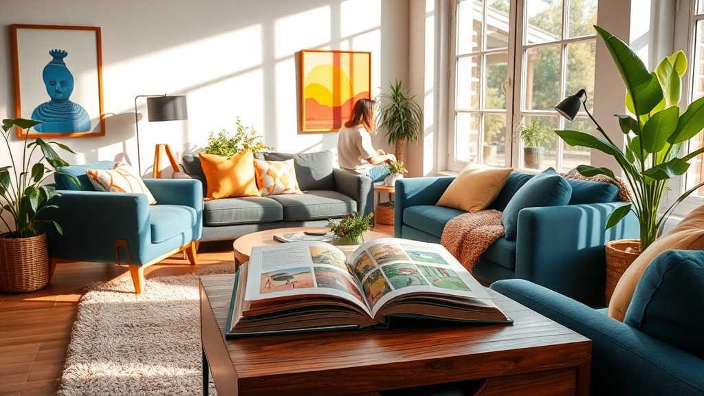
Living Room- Creating Warmth and Connection
- Soft neutrals like beige and taupe establish an inviting, timeless atmosphere.
- Earthy tones such as terracotta, warm browns, and mustard yellow add depth and coziness.
- Deep blues and rich greens create a sophisticated yet comfortable setting.
- Accent walls in bold hues can make the space feel lively without being overwhelming.
Bedroom- Cultivating a Restful Retreat
- Soft Blues: Encourage relaxation and improve sleep quality.
- Muted Greens: Provide a natural, stress-relieving atmosphere.
- Deep Purples: Add a touch of luxury while maintaining a calming effect.
- Warm Neutrals: Shades like soft gray, cream, or blush pink create a cozy, comforting space.
Kitchen- Energizing the Heart of the Home
- Yellow Tones: Boost energy and warmth, making mornings more inviting.
- Crisp Whites & Light Grays: Keep the space fresh and clean-looking.
- Soft Greens: Create a balanced, natural feel, perfect for a lively yet calming environment.
- Pops of Red or Orange: Can stimulate appetite when used subtly in decor.
Home Office- Boosting Focus and Productivity
- Muted Blues: Increase concentration and reduce stress.
- Soft Grays: Provide a neutral backdrop that enhances focus.
- Earthy Greens: Promote balance and creativity.
- Deep Navy or Charcoal: Create a sense of authority and sophistication.
HOW TO INCORPORATE COLOR WITHOUT OVERWHELMING YOUR SPACE?
Accent Walls & Statement Pieces
- Instead of painting an entire room in a bold color, use an accent wall to add personality.
- Feature walls with textured paint, geometric patterns, or unique wallpaper can add visual interest.
- Large artwork, colorful furniture, or statement rugs can introduce strong colors without overpowering a space.
Using Accessories to Introduce Color
- Experiment with colorful throw pillows, lamps, curtains, and vases to refresh your space.
- Swapping out decor seasonally allows you to enjoy different colors without commitment.
- Layering various hues within the same color family creates depth while maintaining harmony.
Layering Shades for a Cohesive Look
- Mix different shades of the same color to add dimension to a space.
- Pair complementary colors (opposite on the color wheel) for dynamic contrast.
- Use a neutral base and add color through furniture, textiles, and decorative elements.
THE ROLE OF NATURAL LIGHT IN COLOR PERCEPTION
How Lighting Alters Color Perception?
- Morning light enhances cool tones, making them appear crisper.
- Afternoon light warms up colors, bringing out golden and earthy hues.
- Artificial lighting can shift color tones, LEDs may make colors feel cooler, while incandescent bulbs add warmth.
Best Colors for Brightly Lit Homes
- Pastels and soft tones prevent overwhelming brightness.
- Deep jewel tones add sophistication without feeling too heavy.
- Whites and beiges reflect light beautifully, keeping the space airy.
Choosing Colors for Dimly Lit Spaces
- Lighter hues help open up darker rooms, making them feel more inviting.
- Warm colors like mustard yellow, terracotta, and creamy beige can counteract cool lighting.
- Strategic placement of mirrors and metallic accents can amplify light.
SELECTING A COLOR PALETTE THAT SUITS YOUR STYLE
Finding Your Personal Color Scheme
- Think about what colors make you feel the most comfortable and inspired.
- Consider the colors you’re naturally drawn to in your clothing and surroundings.
- Use a mood board to experiment with different combinations before committing.
Understanding Complementary & Analogous Colors
- Complementary Colors: Opposites on the color wheel (e.g., blue and orange) create contrast.
- Analogous Colors: Side-by-side hues (e.g., green, teal, and blue) produce a cohesive look.
- Monochromatic Palettes: Various shades of a single color create a sophisticated, layered effect.
Exploring Trending Color Palettes for 2025
- Warm Earth Tones: Burnt orange, sage green, and soft terracotta.
- Deep Jewel Tones: Emerald green, sapphire blue, and rich burgundy.
- Muted Pastels: Dusty pinks, powder blues, and warm lavenders.
- Bold Contrasts: Black and gold, navy and white, or mustard and charcoal.
The colors you choose set the emotional tone of your home, influencing how you feel every day. By understanding the psychology of color, you can create a space that supports your lifestyle and enhances your well-being. Whether you prefer calming neutrals or bold statement shades, color is a powerful design tool that transforms any space. Start small, experiment with different tones, and watch how the right hues bring your home to life.
Discover how color psychology shapes home decor. Learn to use colors effectively to set the right mood and create a space that truly reflects your style.
Recent Blogs
-

All You Need to Know About TradeTracker Before Investing
-
Uses of Natural Sleep Support Supplements: What They’re Commonly Taken For
-

Streetwear Trends 2025: How Decarba Reflects Today's Urban Fashion
-

Whole-Food Nutrition Meets Modern Life: Why Organ Supplements and Natural Blends Are Gaining Popularity
-

From Smoothie to Salad: How to Use Premium Dates in Every Meal